BUSINESS GOAL
My Role
Platform
Readly is an all-in-one marketplace which addresses your requirements for travel by car. Through the app based on your usage, we provide you various options to rent, lease and share car services based on the user needs. The goal was to improve the experience of offering cars as a service and help provide an understanding on the benefits of diversifying your car needs
.avif)
.avif)


We conducted interviews, surveys and online research to develop our understanding of our potential customer base.

20-25% of urban residents in major Swedish cities engage with car-sharing or mobility apps at least once a year.
Active users typically book or use the service about 2–3 times per week.
Around 25–30% of app downloads convert to active bookings, and retention rates over three months tend to hover around 65–70%.
User penetration is approximately 2.1% in 2024 and is projected to rise to about 2.4% by 2029—translating to an estimated 260,000 active users.
Estimated Growth Rate of 15–20%, fueled by increasing urbanization, environmental policies, and a shift toward sustainable transportation.
The broader car rental and leasing market in Sweden is also significant, with revenues forecasted to reach roughly US$486 million by 2025.
As a result of our research, we gathered three key insights that we used to guide the project:
Car sharing is preferred: Platforms like SnappCar or Turo let private car owners rent out their own vehicles. Car sharing offers a “pay-as-you-go” alternative to car ownership, making driving more affordable, flexible, and resource‑efficient
Bit hesitant towards leasing: Rising living costs have made long‑term commitments less attractive. Leasing providers need more flexible terminations, shorter-duration plans, or “lease-to‑own” hybrids to retain customers
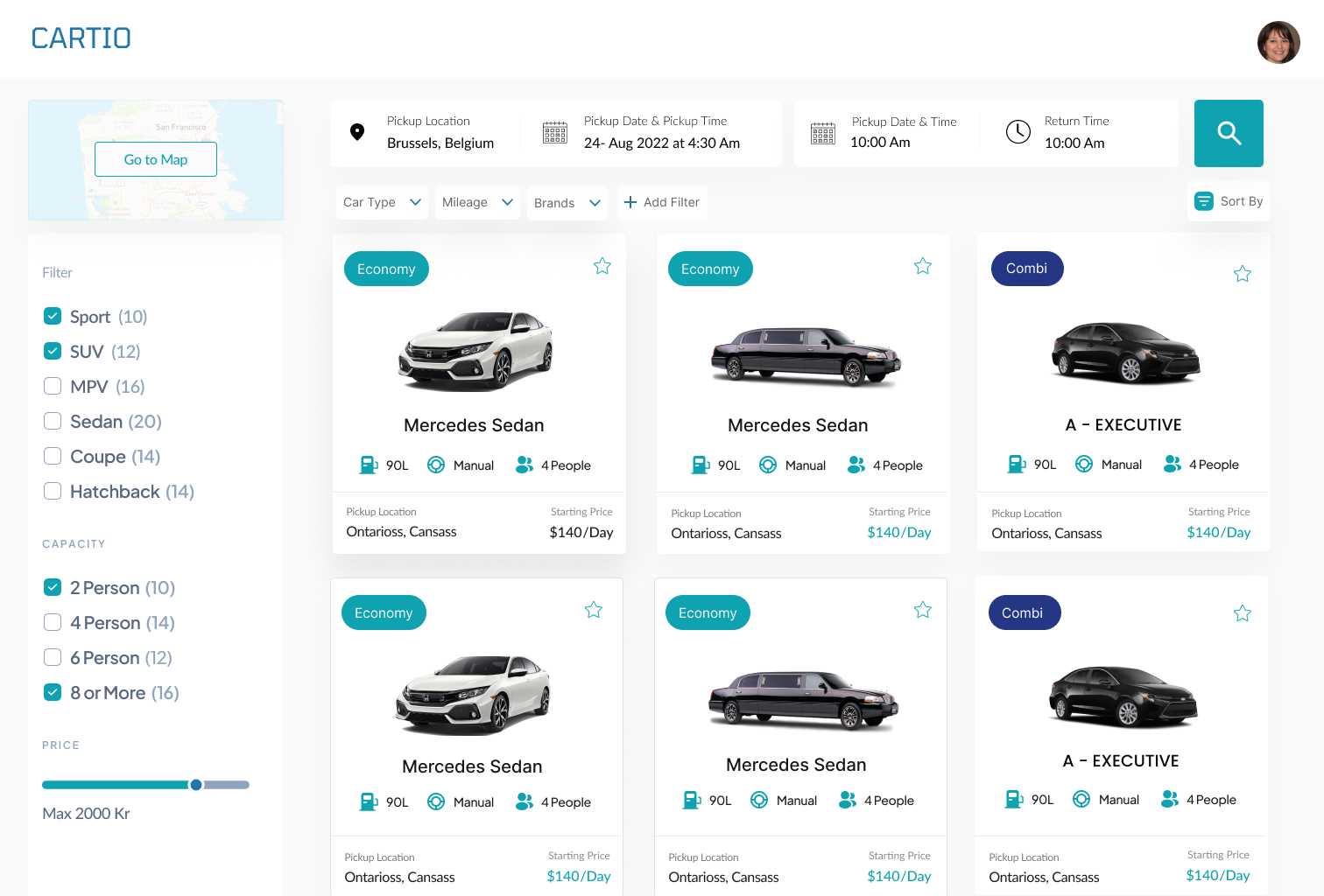
Digital Clarity: Surface all fees upfront, add contextual help for fuel policies, and streamline booking to one or two screens. Basically no hidden fees or packages.


The experience journey map was drafted to get further insight into our goals and analyse what would be a great way to move forward and what features are required to be focused on.

Carefully structured to provide an intuitive user journey, balancing educational content, interactive features, and community engagement.
Early wireframes led to interactive prototypes, which were tested and iterated on. This phase was crucial for refining user flows and interface elements.
Focused on creating a visually appealing and emotionally engaging experience. The design incorporated nature-inspired themes, intuitive icons, and an easy-to-navigate layout.
Special attention was given to making the app accessible to all users, including those with disabilities. Features like screen reader compatibility, color blindness modes, and scalable text were included.
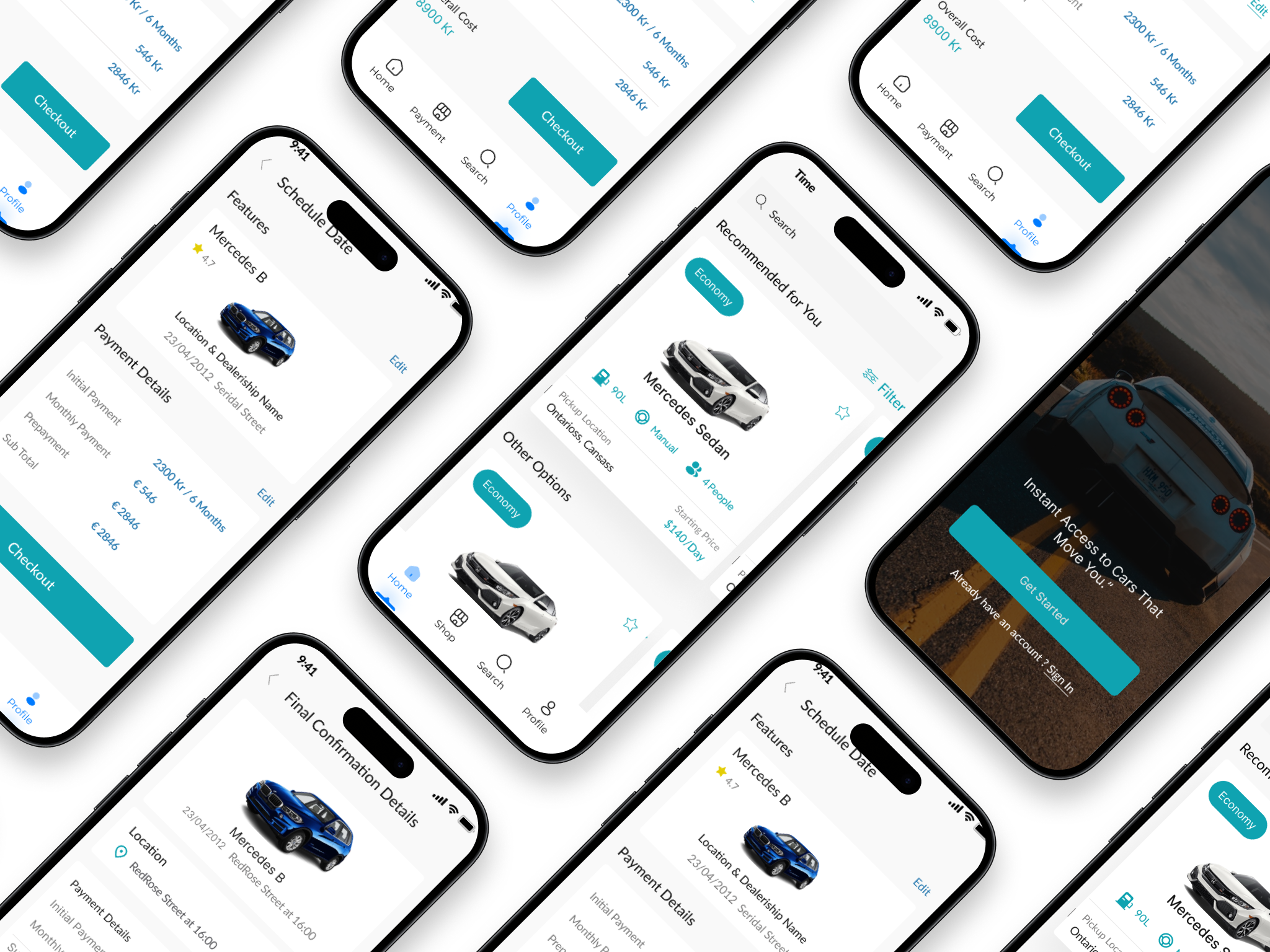
As a sole designer, I created the designs for both the mobile app and the website for Crumbs. The main product for crumbs is the mobile app, and the website that was built was mainly intended for the purpose of marketing and advertising what Crumbs, as a company, gives value to.When rolling out all the screens, careful attention was paid so that the color hierarchies were respected. White space was used generously to keep the layouts uncluttered and to balance out the vibrancy.
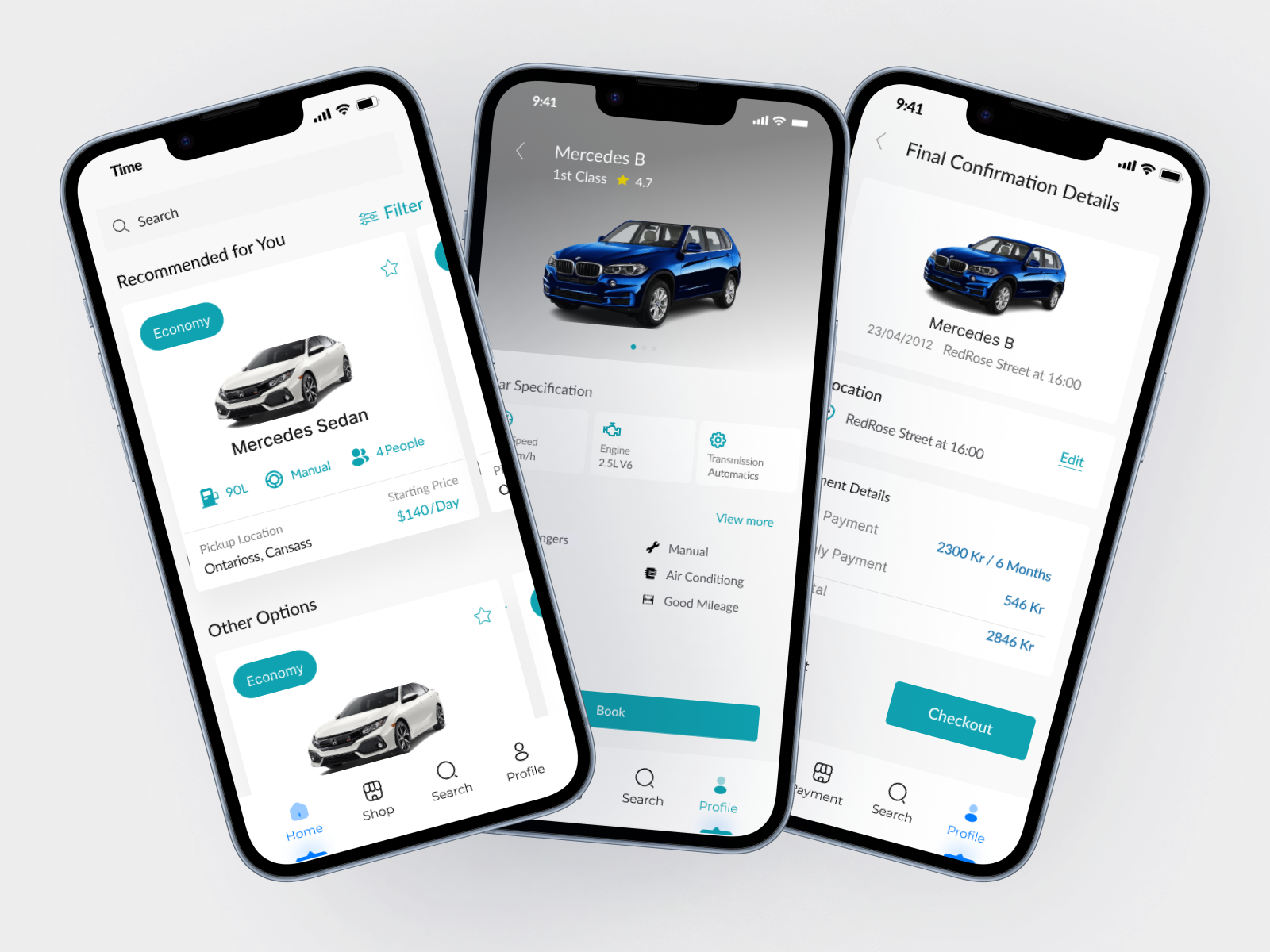
As a sole designer, I created the designs for both the mobile app and the website for Crumbs. The main product for crumbs is the mobile app, and the website that was built was mainly intended for the purpose of marketing and advertising what Crumbs, as a company, gives value to.When rolling out all the screens, careful attention was paid so that the color hierarchies were respected. White space was used generously to keep the layouts uncluttered and to balance out the vibrancy.
As a sole designer, I created the designs for both the mobile app and the website for Crumbs. The main product for crumbs is the mobile app, and the website that was built was mainly intended for the purpose of marketing and advertising what Crumbs, as a company, gives value to.When rolling out all the screens, careful attention was paid so that the color hierarchies were respected. White space was used generously to keep the layouts uncluttered and to balance out the vibrancy.
Post-launch, we closely monitored user engagement and app performance. The app quickly gained popularity, evidenced by its download numbers and active user rates. However, our journey didn't stop at launch. We continually collected user feedback, leading to several updates that improved user experience and expanded app functionalities.
Segment-based UX supported varied user goals: functional for commuting, exploring, corporate use, and flexible living.
Flexible commitments (short leases, subscriptions, and sharing) appeal to cost-conscious markets.
UX clarity—no hidden costs, streamlined flows, elevated trust, and simplification.