Needs a car forDaysThe weekend trip
A car for a trip, with no surprise fees
Weighing up
Product DesignUX ResearchUI Design
I designed Cartio from zero: one mobile flow that helps people choose between renting and leasing a car. The decision-first approach held up in early user testing and helped secure VC backing.
Early testing rounds validated the concept and secured investor backing
Renting and leasing merged into one duration-led flow
From picking a car to a full, no-surprise cost breakdown
The iOS app was the product; the web version stayed exploratory
Help someone decide between renting and leasing, see the true cost as it forms, and act on that decision without repeating themselves?
One decision-led flow, from the first question to a recommendation, recorded from the clickable prototype.
Cartio wanted getting a car to feel as simple as any other service, and to show why having more than one way to get one matters in the Nordic market.
The catch: every competitor treated renting and leasing as two separate products, each behind its own flow. People didn't think that way. They had one question: what's the cheapest way to have a car for the time I actually need it?
I ran the interviews, worked alongside the founder, the PM and three engineers, and made the case for one decision-led flow instead of two separate ones. My job was to back every call with reasoning that balanced what users needed against what the business had to hit.
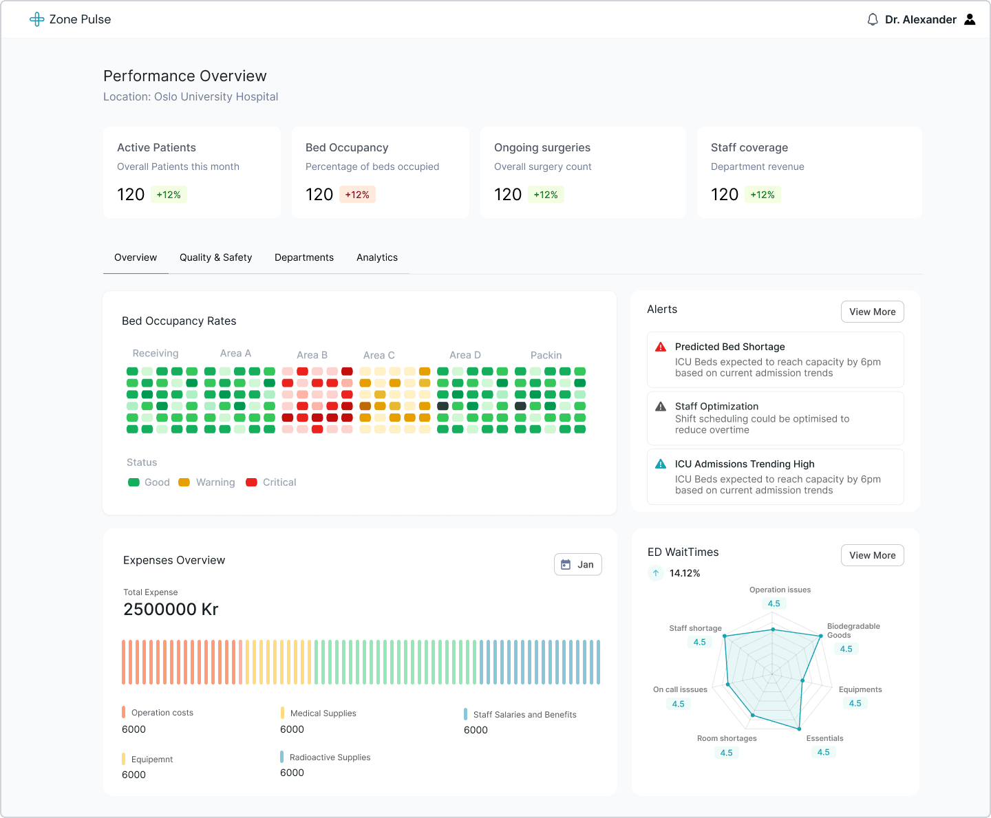
A department head sees the bottleneck forming in time to actually do something about it.
People had options. What they lacked was help making the decision. In the interviews, three things kept coming up.
Insight 01
A flexible, affordable alternative to car ownership.
Insight 02
Shorter terms and flexible exits can reduce commitment anxiety.
Insight 03
Show fees, fuel policies and the booking path upfront.
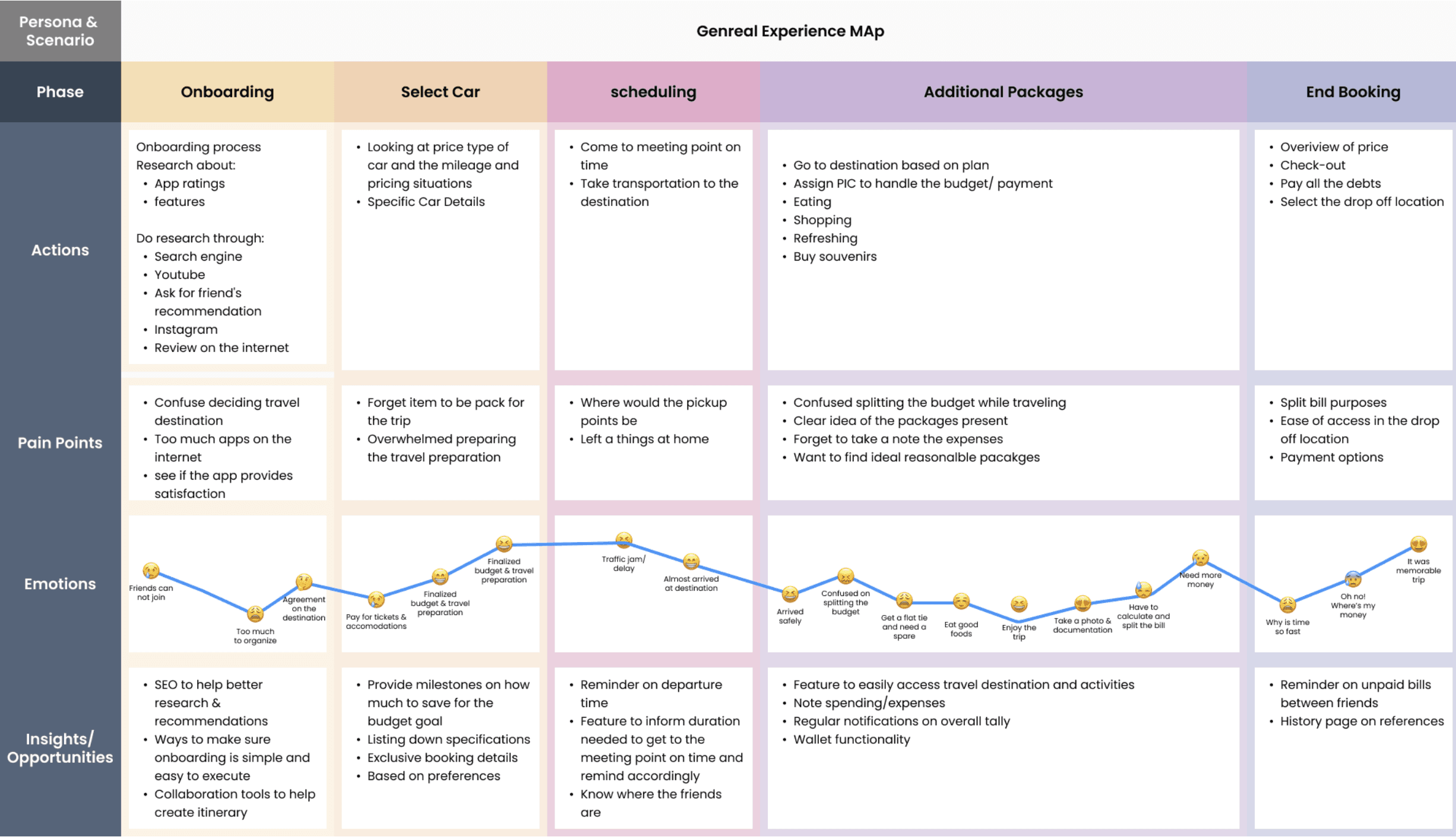
Renting and leasing are sold as separate products, by separate companies, with separate prices. I mapped what someone has to do to compare them, along the one thing they actually start from: how long they need a car.
From the interviews I ran with people looking for a car, working alongside the founder, the PM and three engineers.
A car for a trip, with no surprise fees
A car for a project or a move, without a long contract
A newer car without feeling locked in
The gap sat in the first column. Nobody put renting and leasing side by side for the time you actually need a car.
The interviews and the journey map surfaced six opportunities. I scored each on how hard users pulled for it, business value, what three engineers could build for V1, and what no competitor offered. The decision moment won. The rest were built small, scheduled or cut.
Undecided people will answer a question before browsing
Checked through The 'not sure yet' path, added late
Building the cost step by step won't hurt completion
Checked through Prototype testing
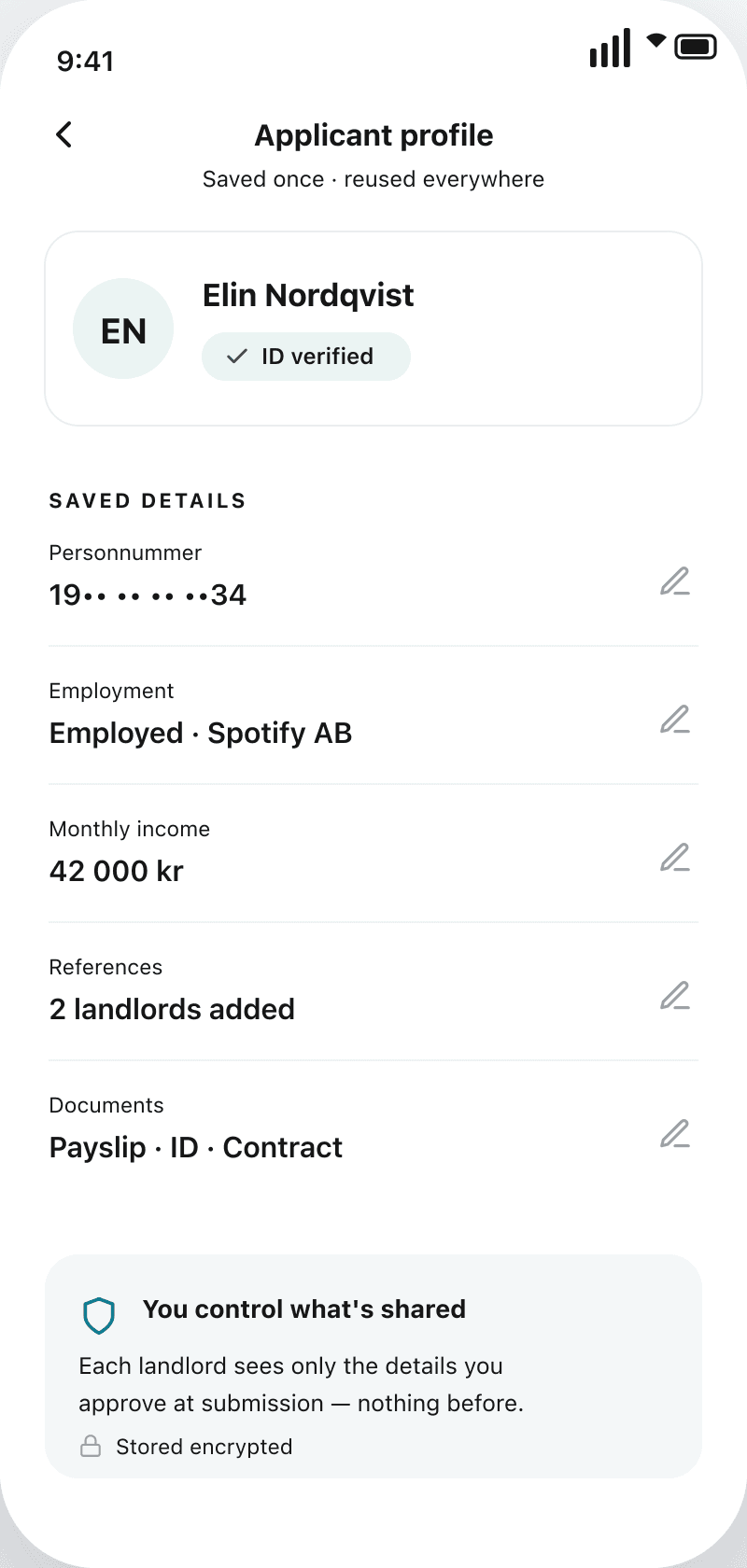
People will store their ID and income once
Checked through Consent asked per application
People start from a need and a duration, not a product
Checked through Interviews
Booking before verification won't raise drop-off
Checked through Reminders after booking
Captured intent is clean enough to train a recommender
Checked through V2, gated on data
Rent and lease as separate products, the way competitors sold them.
It made people pick a product before they understood the trade-off.
Listings first, with rent and lease prices on every car.
Undecided people had no path to a decision.
One question up front about what you need, with a 'not sure yet' path.
Intent is captured early, so every later screen is tailored.
Chose Decision first over Two flows and Browse first.
I mapped the journey around one question: how can someone pick the right way to get a car without committing before they understand the trade-off?
It starts with a practical need, like a commute, a weekend trip or a few months of access, not a preference for renting or leasing.
So instead of making people choose between two products up front, I kept both options visible and let duration, cost and commitment drive the decision together. The unified flow cost more to build: one screen had to reconcile two pricing models, two contract types and two inventories. I defended it by scoping the MVP tightly to the decision moment and deferring everything else.
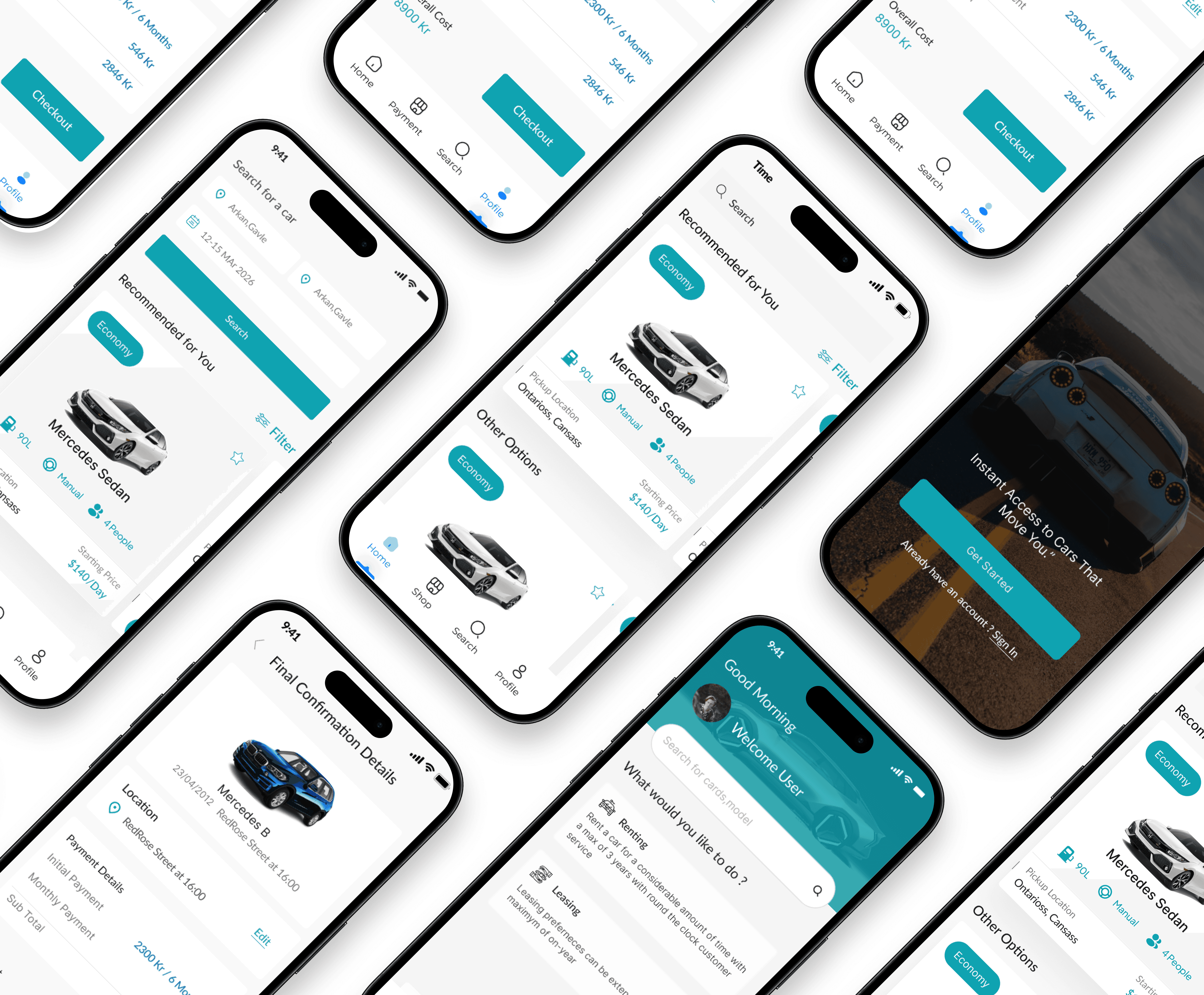
Cartio's journey was designed mobile-first. The app is where the rent-or-lease decision actually happens, so most of the work went into the mobile flow: search, recommendations, the duration-led comparison and checkout. Alongside it I explored a website version of the same journey, mainly to see how the search and car-detail patterns would hold up on a larger screen. The web mockups stayed exploratory. The mobile app was the product.
Choosing between renting and leasing a car is a big decision people rarely make. These are the trades I made to support it: the move, what it cost, and why I thought it was worth paying.
Undecided users meet a choice before they can browse.
Intent is captured up front, so every later screen is tailored — fewer dead-end paths.
More screens sit between intent and checkout.
Sticker shock drops and completion holds; the next number is always in view.
Secure storage and consent for sensitive data.
One profile unlocks any listing — repeat applications go from minutes to a single tap.
Leans on third-party APIs with uneven latency.
Users self-qualify before applying, cutting rejected applications downstream.
Applications sit incomplete longer, needing nudges.
Momentum is kept at the moment of intent; verification becomes a follow-up, not a wall.
Five moves that turn a listings marketplace into a product that helps people decide, then act.
A rent-or-lease question up front routes people into a flow tailored to their answer, with a “not sure yet” path that keeps browsing open.
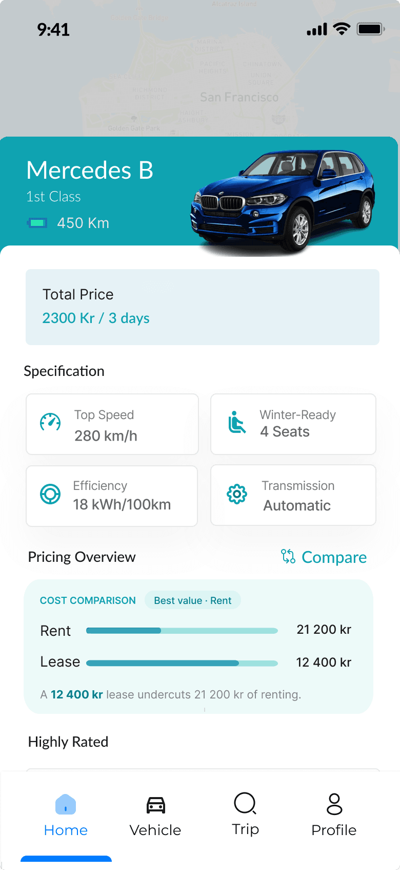
Rent and lease sit side by side on the car itself, priced for the trip length, with the better value called out and the break-even named.

The price builds one add-on at a time with the total always pinned, so nothing springs at checkout.
Identity, income and references are captured once and pre-filled on every application, with consent handled per submission.
Intent converts immediately; verification follows with reminders instead of blocking the booking.
One live surface was feasible today. Letting the model act, not just advise, waits on trust it hasn't earned yet.
A live view per role, with AI insights you can simulate before acting.
Live in V1Confidence and reasoning on every call; the wrong-prediction state designed first.
Feasible nowThe model pre-fills shift changes, once it has earned the trust.
Gated on model trustTrust in the model was the whole product, and I still designed the happy path first.
Prototype the wrong-prediction state on day one, not patch it in late.