Hospital Director
- Trying to
- Keep the hospital ahead of occupancy spikes
- Decides
- Beds, budget, extra staff
“We scramble when occupancy spikes, but the data arrives too late.”
Product DesignUX ResearchUI Design
I designed a hospital operations dashboard, then let department heads choose its AI. They picked a capacity simulation over written summaries, and that version shipped.
Summaries vs capacity simulation, tested with department heads; the simulation shipped
Patient flow, staffing and compliance unified into one view
Director, ICU head and compliance officer — one dashboard, three lenses
Trend and scenario insights generated from live feeds, flagged before critical load
Give hospital leaders one live picture they can plan from, hours before a surge instead of minutes into it?
A hospital operations dashboard built around one question: what needs a decision in the next few hours? From the live command view to an AI insight and a tested plan.

Zonepulse is a hospital operations dashboard I designed from zero for administrators and department heads. Patient flow, staffing and compliance lived in separate systems. By the time anyone pieced them together, the delay or the compliance risk had already happened.
A department head sees the bottleneck forming in time to actually do something about it.
I interviewed people in three roles, audited every live data source, shadowed shifts on the floor, and tested early versions against real decisions. The same thing kept coming up: the hospital already had the data to see problems coming. It just never reached the person who could act, in time to act.
Before choosing what to build, I mapped how capacity decisions actually get made: who makes them, on which time horizon, and with which data.
Three roles read the same hospital on different clocks. The quotes are from the interviews.
“We scramble when occupancy spikes, but the data arrives too late.”
“I need real-time alerts before we hit critical load.”
“Reporting is reactive. By the time it's filed, it's already a crisis.”
Benchmarking Epic and Tableau Healthcare confirmed the gap. Centralised dashboards with predictive alerts were rare in Swedish systems: most showed what had already happened, not what was about to.
Research surfaced five opportunities. I scored each on how hard users pulled for it, what the hospital needed, what we could build, and what nobody else offered. The top two became the product. The rest were built small, parked or gated.
Dashed line: the lowest picked score (17). Everything at or above it went into the product.
Before opening Figma, I pressure-tested the structure with Gemini and Claude, then had v0 generate a starter dashboard to react to.
Result It made the wrong choices obvious fast: too dense, a flat hierarchy, charts built to impress. Which metric an ICU head needs at 7am came from context, not the model.
One data source, a tab per role, each tuned to what that role acts on.
Result One truth for everyone, without the director's view drowning the ICU head.
A written summary of each prediction, against a capacity simulation leaders could move.
Result Settled by the A/B test: the simulation shipped.
Three decisions, each with a cost I chose to accept.
One live command view. Beds, staffing and equipment in one place, filterable by department, role and time window. The cost: integrating systems that refresh on different clocks.
Glanceable over dense. The wall has to read from across a ward under pressure, so status comes first and drill-down second. The cost: deep analysis moved off the main screen.
An AI layer that assists, never decides. It flags staffing and equipment gaps as they form and points to the units most at risk. The staffing and bed calls stay with the people accountable for them. The cost: forecasting hours ahead raises more false alarms than a reactive threshold, so every prediction has to show its reasoning.
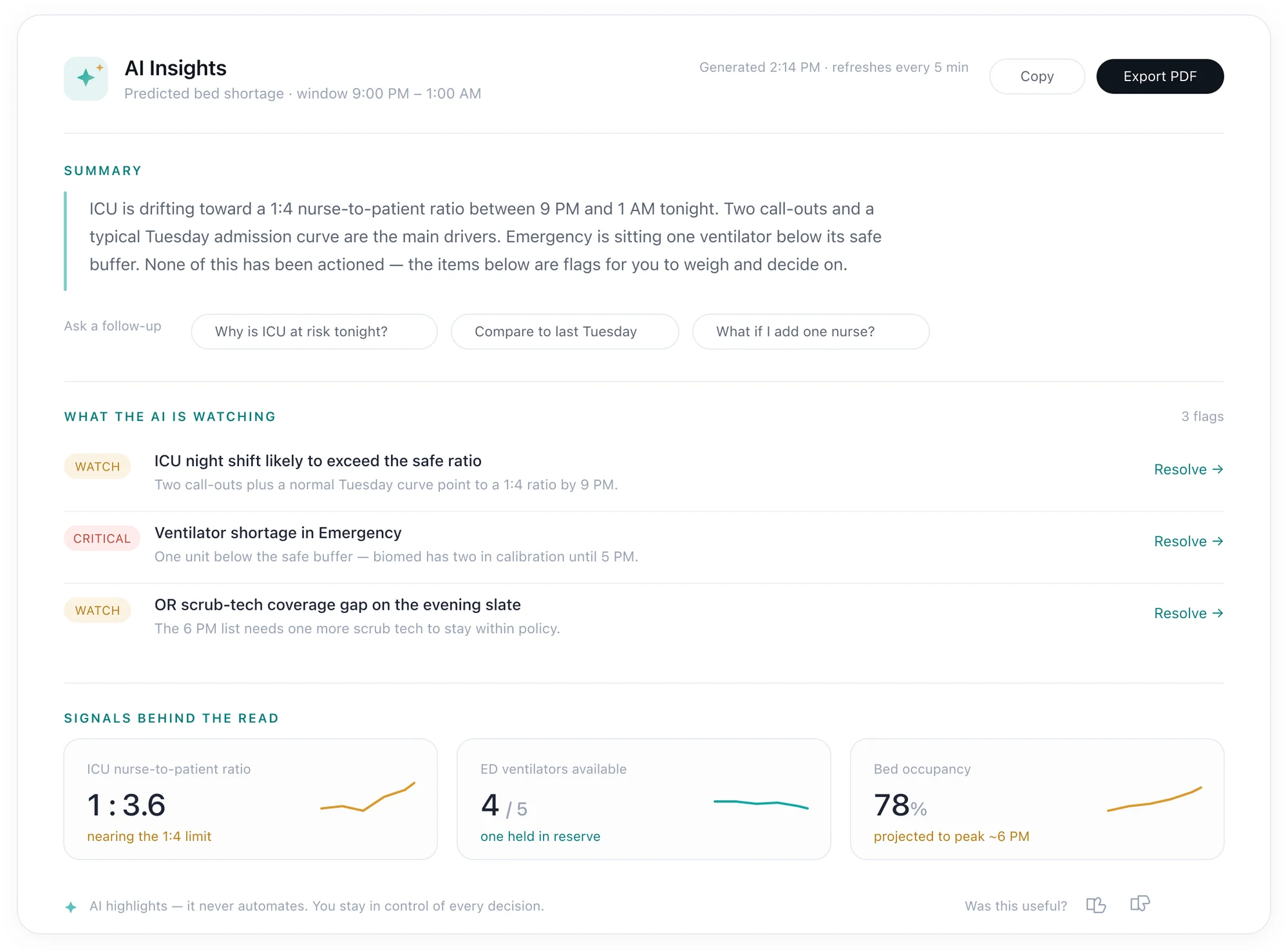
My first version of AI Insights explained each prediction in a written summary. I tested it with department heads against a version that let them simulate capacity themselves, and let the result decide what shipped.
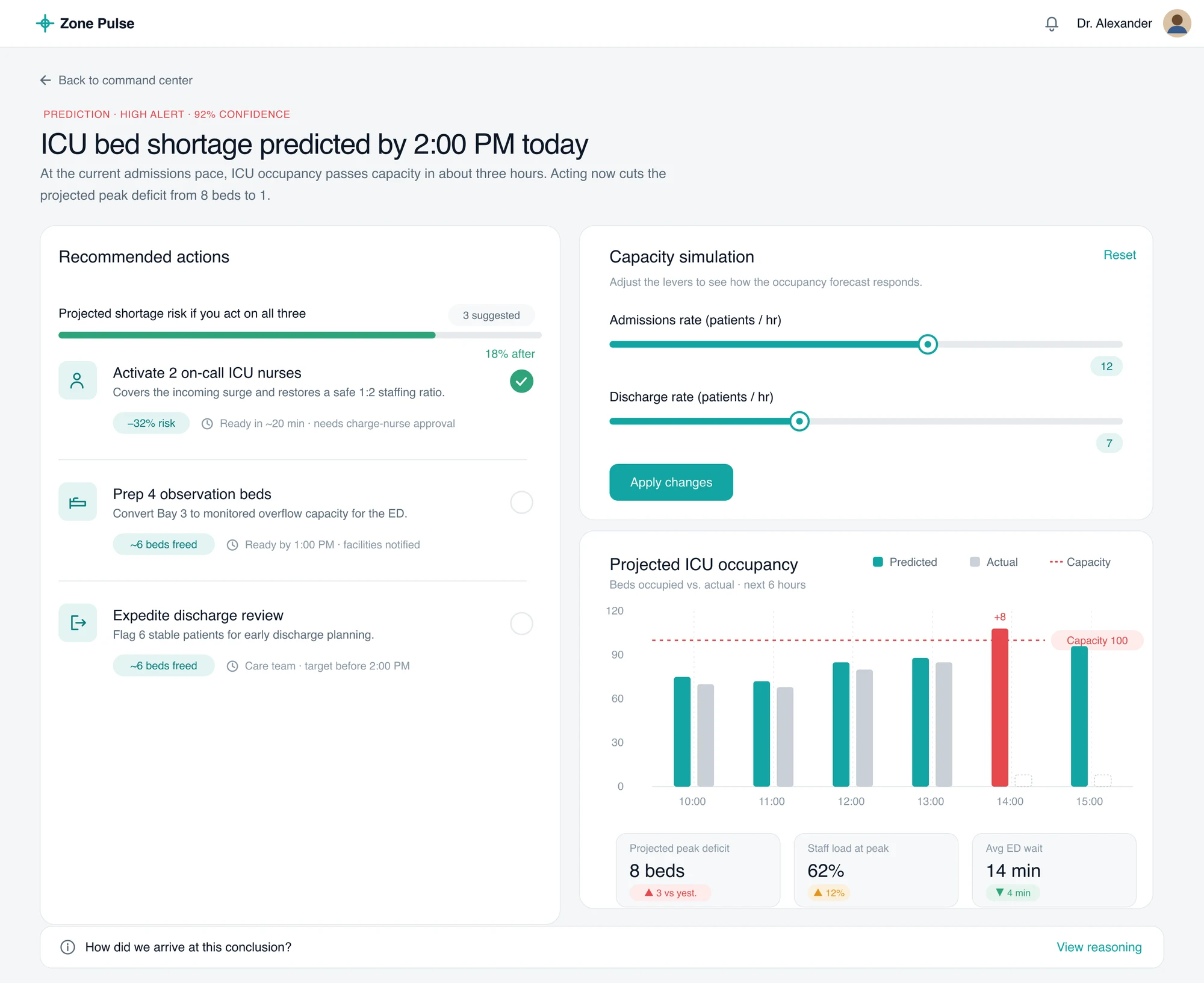
Every AI prediction now opens with its recommended actions next to a capacity simulation, so a department head can test the plan on the forecast before committing staff or beds.
The whole hospital on one live screen, the AI insights one click behind it, and one alert followed across three tabs.
Patients, beds, surgeries and staff load as one live view: bed occupancy by area, the alerts behind it, 30-day trends and coverage gaps. A director sees where pressure is building before anyone calls.
Generate Summary opens AI Insights over the overview. Every prediction is sorted by the decision it needs, with its confidence, where it came from and two next steps.
Analytics forecasts the ICU filling up, Departments shows the ward behind it with its staff and open shifts, and Quality & Safety shows whether care and reporting stay on track. Same live data, one tab apart.
One live surface was feasible today. Letting the model act, not just advise, waits on trust it hasn't earned yet.
A live view per role, with AI insights you can simulate before acting.
Live in V1Confidence and reasoning on every call; the wrong-prediction state designed first.
Feasible nowThe model pre-fills shift changes, once it has earned the trust.
Gated on model trustTrust in the model was the whole product, and I still designed the happy path first.
Prototype the wrong-prediction state on day one, not patch it in late.