Investing you can read in one glance
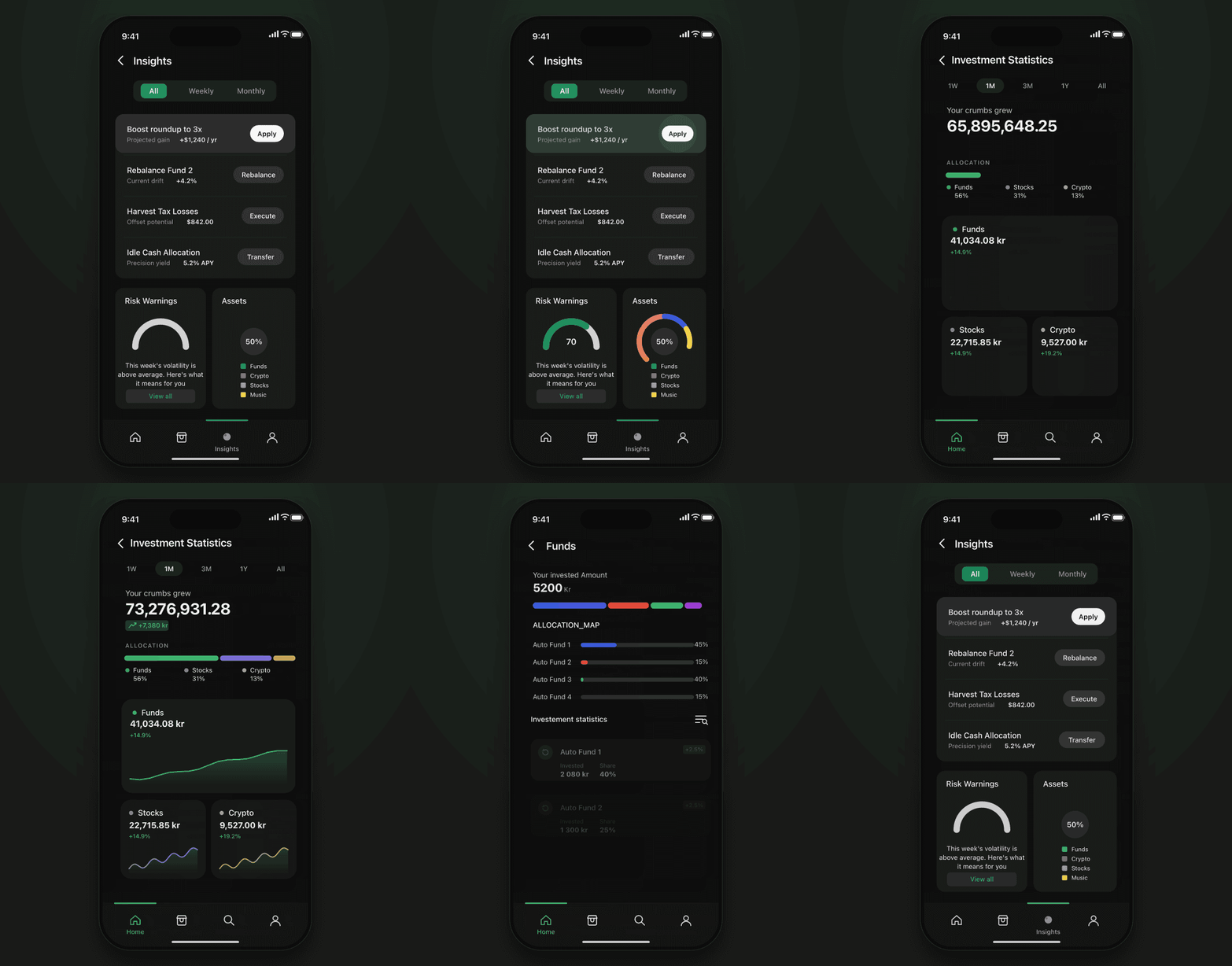
V2 leads with what you own and whether it grew, one allocation strip and a tile per asset. Insights become one-tap actions, each showing its projected effect before it fires.
Product DesignUX ResearchUI Design
I took Crumbs, an iOS micro-savings app, from V1 to V2 on one consistent system. In testing, setup completion and engagement each came out about 10% ahead of V1.
Setup completion and engagement, each about 10% ahead of V1 in testing
Full redesign to a consistent, scalable UI system
Type scale, components and spacing unified across every screen
Launch-ready build that drove free-to-paid interest
Make a savings app that already worked feel trustworthy enough to hand it recurring money?
The investing side of V2, rebuilt on one type scale and one component set.
Crumbs invests small amounts automatically into a diversified portfolio, turning everyday purchases like a morning coffee into steady progress toward a bigger goal, without young savers having to think about it.
V1 already worked. My job as product designer was to take it to V2: make it feel as reliable as it already was, and leave the team a system they could keep building on. I delivered a launch-ready MVP, a systemised UI kit and a high-fidelity interactive prototype.
A department head sees the bottleneck forming in time to actually do something about it.
Interviews, surveys and my audit of V1 all pointed at one diagnosis: V1 worked, but it didn’t feel trustworthy. The mechanics were there. The confidence wasn’t.
Four gaps kept surfacing, and every one was about consistency:
Typography had no hierarchy, so screens were hard to scan and nothing signalled what mattered.
Visual style drifted screen to screen, so the app felt assembled rather than designed.
Branding was generic and did nothing to earn trust or identity.
Components varied in spacing, states and usage, so the same control behaved differently in different places.
Each one was small. Together they read as something is off, the last impression you want from an app asking to move someone’s money.
I set out to make V2 feel as reliable as V1 already was: to turn working software into visible trust. Three principles held it together: hierarchy to cut cognitive load, clarity over visual noise, and trust through consistency.
A real type scale. One hierarchy across dashboards, forms and summaries, so the eye lands on the number that matters first.
A calmer brand. Consistent colour and a quieter tone that signal stability without shouting over the content. That’s the register a money app should speak in.
One component system. Standardised spacing, states and layout rules, so every screen reads as built by one hand, and the team ships faster because the decisions are already made.
What it cost. A rebuild the team couldn’t ship was never on the table, so I worked component-first: shared type, spacing and states that paid for themselves in faster iteration instead of adding scope. And turning round-ups on by default meant keeping the opt-out one tap away on every screen that mentions them.
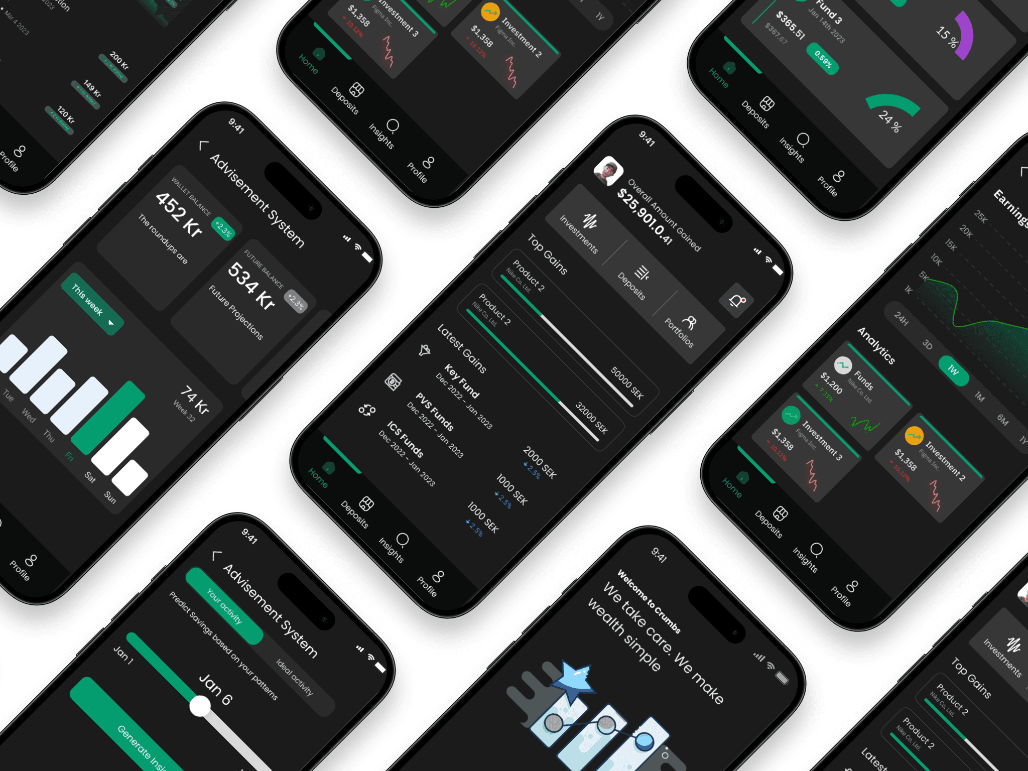
Reaching the first save fast meant trading up-front control and depth for momentum. Each row is the move, what it cost, and why it earned its place.
Key design decisions
V2 was measured against V1 through usability testing, behavioural observation and side-by-side comparison. On the two metrics it was judged on, savings setup completion and engagement with the app, V2 came out roughly 10% ahead.
What moved:
V1 had no consistent design language. Buttons styled differently across screens, type sizes that didn't follow a scale, spacing that shifted between flows. Each screen looked like it was made by a different person on a different day. That's the signal a user picks up on, even if they can't name it.
A user committing recurring money to an unfamiliar product reads visual inconsistency as operational inconsistency. Misaligned baselines, drifting type scales, inconsistent corner radii: these don't register as design flaws. They register as something is off. In a money product, that's the end of the conversation.
Verification is deferred, adding steps later.
Users feel the product work in under a minute — activation comes before paperwork.
Less control up front; the opt-out had to be obvious.
Saving starts on its own, so most users never have to decide to begin.
Can feel trivial to bigger, high-intent savers.
Small wins compound into a habit — the streak, not the balance, is the hook.
Longer screens that risk interrupting the flow.
Education lands when it is relevant, so opt-in to investing rises without a separate funnel.
A nudge that tips into naggy if pushed too hard.
Early retention climbs where it matters most — the first seven days.
Four moves that made V2 feel as reliable as it already was.
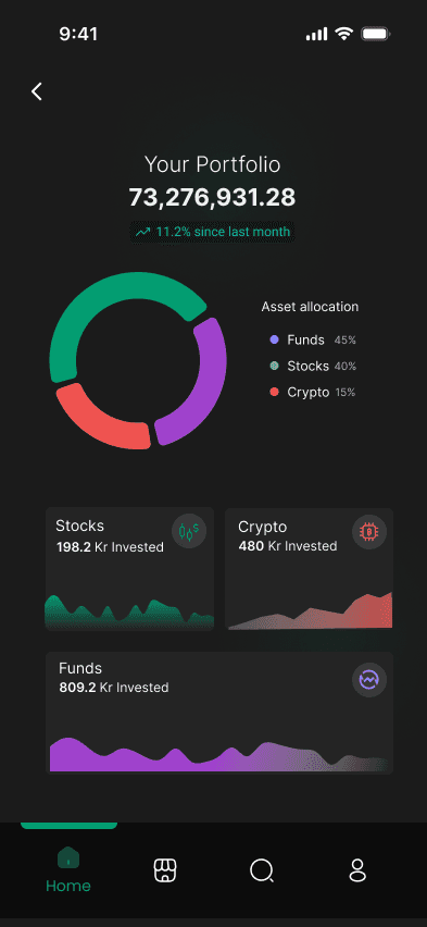
V2 leads with what you own and whether it grew, one allocation strip and a tile per asset. Insights become one-tap actions, each showing its projected effect before it fires.

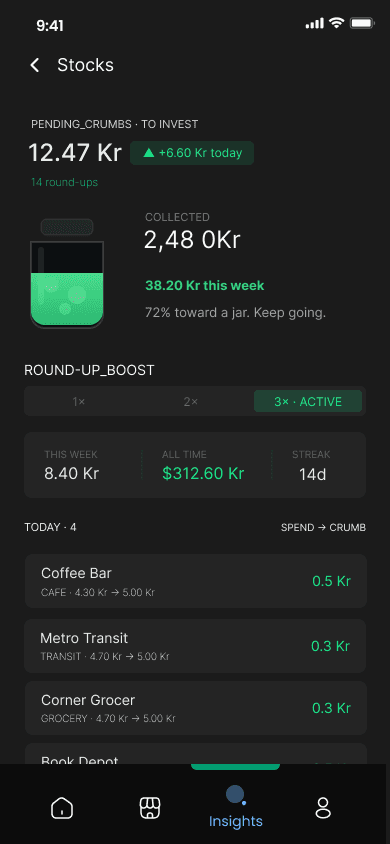
V1 buried investing in settings. V2 turns round-ups on from the first save, shows the jar filling and the week's total, and keeps opting out one tap away.
The total and its monthly change lead, then the split across funds, stocks and crypto. Each asset opens its funds: what went in, when, and its share.
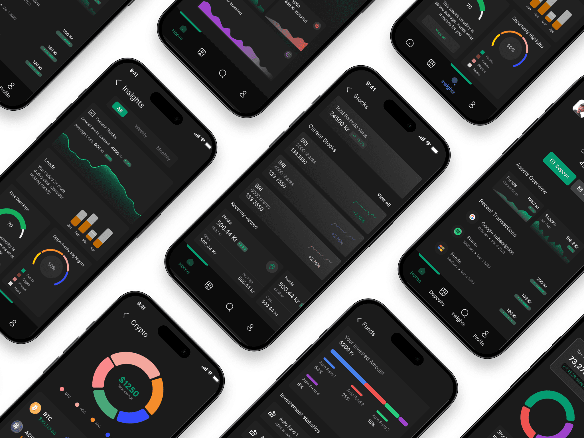
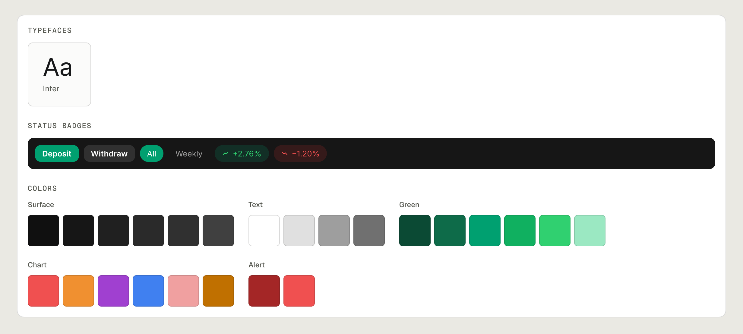
One typeface, one set of status badges and one colour ramp, with a chart palette that never competes with the accent. Every screen reads as built by one hand.
One live surface was feasible today. Letting the model act, not just advise, waits on trust it hasn't earned yet.
A live view per role, with AI insights you can simulate before acting.
Live in V1Confidence and reasoning on every call; the wrong-prediction state designed first.
Feasible nowThe model pre-fills shift changes, once it has earned the trust.
Gated on model trustTrust in the model was the whole product, and I still designed the happy path first.
Prototype the wrong-prediction state on day one, not patch it in late.