Leaderboards
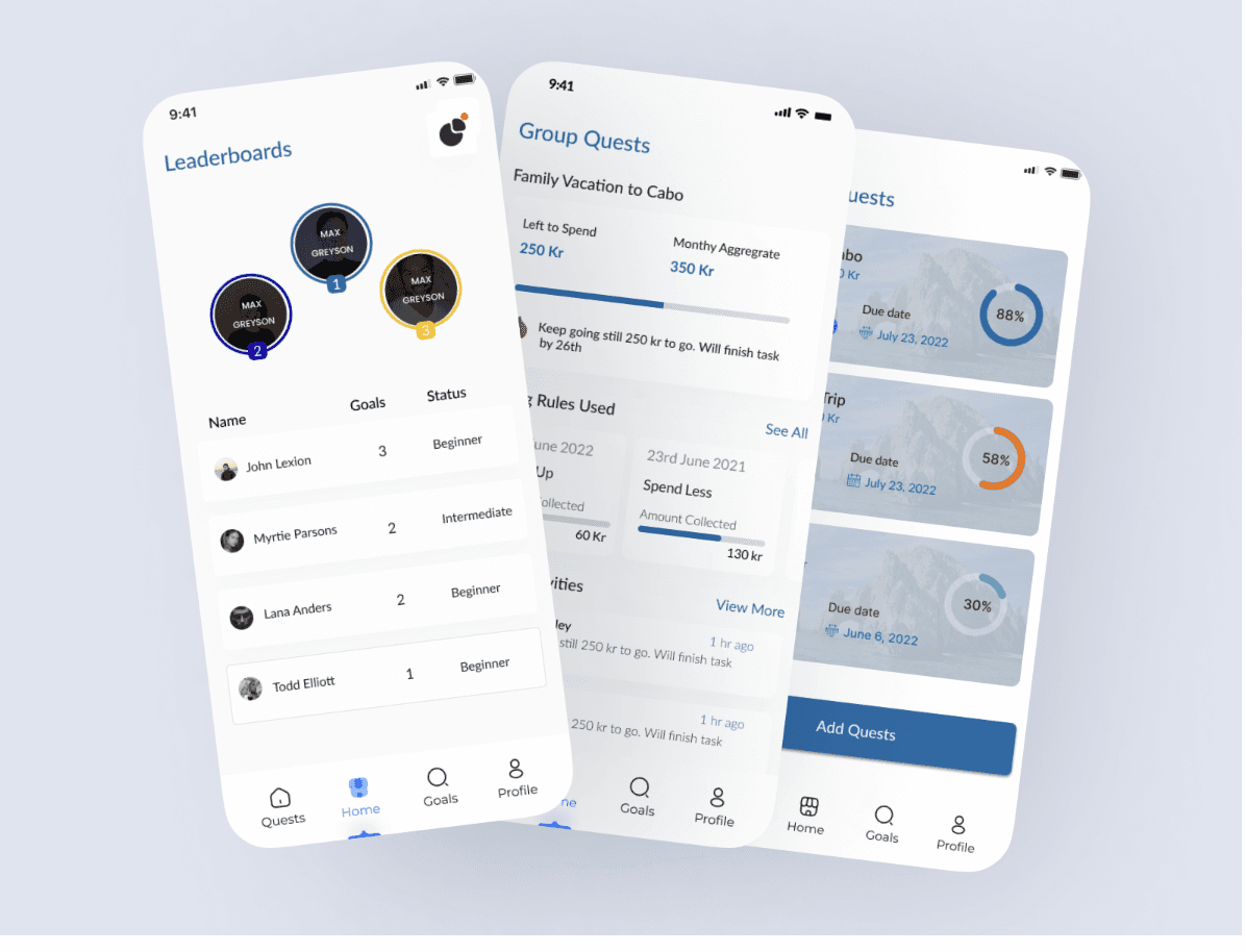
Savers were ranked against each other and their family on one board. Meant to motivate, it read as a race nobody had signed up for.
Product DesignUX ResearchUI Design
I A/B tested gamified saving against a plain control. Activation fell 7% and setup completion 6–8%, so I reverted it.
Savings setup completion under gamification — why I reverted
First-week activation with leaderboards + family nudges
Retention — no lift despite the added social pressure
Control vs Octalysis-driven gamified flow, read on setup completion + first-week activation
Test whether shared progress changes how consistently people save, without exposing anyone's money to their peers?
The two variants from the A/B test. Version B layered leaderboards, group quests and badges onto the same private savings app.
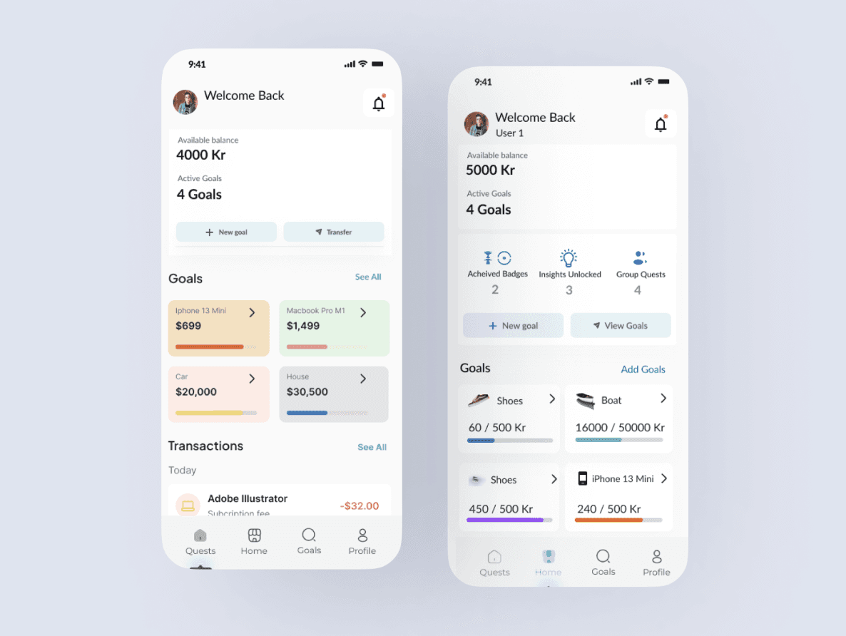
Savely is a micro-savings app that sets money aside as people go about their day, without them having to think about it. I ran one experiment on it, as an A/B test: would gamification, meaning leaderboards and family-based nudges, get people to save more through social motivation?
Saving feels quiet, private and pressure-free. The product never makes falling behind feel like failing.
Before designing anything, I ran a short questionnaire to understand how people save and manage money. It covered four areas: mobile usage, mobile-banking familiarity, money-management habits, and awareness of their children’s spending.
Key findings
People wanted a clearer picture of their cash flow: how income and spending change over time.
Saving was a priority, and they wanted more control over family-related expenses.
The second finding shaped the experiment. Family already influenced how people spent. Could it also influence how they saved?
Introduce some ease-in/ease-out functionalities after each component. Once a component is completed and they go to the next component in the scroll, introduce some ease-in/ease-out functionalities within the case study itself as each component comes into view.
I built two versions. Version A was the standard app, as the control. Version B added gamified, incentive-driven elements, designed with the Octalysis framework: eight core drives that shape how people engage, used to decide which emotion each element should evoke.
What I tested
Leaderboards comparing savings progress
Family-based nudges encouraging collective saving
Messaging framed around shared goals and visibility
What I measured
Savings setup completion
First-week activation
Testing a social-accountability idea cleanly meant trading signal strength for privacy and rigor. Each row is the call, what it cost, and why it held up.
Sharing financial behavior raises real privacy concerns.
The test targets the one lever most likely to move savings behavior, not a safe tweak.
Smaller samples, so significance comes slower.
Results are trustworthy enough to actually ship on — rigor over speed.
Weakens the social signal the test measures.
Consent is preserved, so the feature can survive contact with real users and reviewers.
Softer behavior change for far lower risk.
Users are not punished for slipping, so drop-off from guilt stays low.
Undervalues large but irregular savers.
The metric rewards the habit the product is trying to build, not one-off deposits.
Version B added three social mechanics to a private savings app. Each card shows what it looked like and what it did to the numbers.
Savers were ranked against each other and their family on one board. Meant to motivate, it read as a race nobody had signed up for.
Family goals became group quests with each member's contribution on show. Support turned into accountability: one tester worried about letting their spouse down.
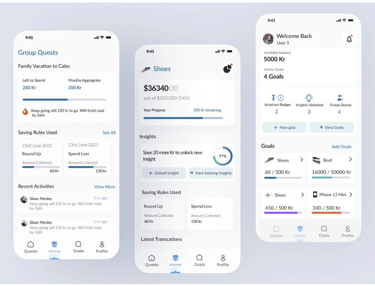
Version B put badges, unlocked insights and quest counts above the same goals as Version A. Against the control, setup completion fell 6–8% and first-week activation fell 7%.
One live surface was feasible today. Letting the model act, not just advise, waits on trust it hasn't earned yet.
A live view per role, with AI insights you can simulate before acting.
Live in V1Confidence and reasoning on every call; the wrong-prediction state designed first.
Feasible nowThe model pre-fills shift changes, once it has earned the trust.
Gated on model trustTrust in the model was the whole product, and I still designed the happy path first.
Prototype the wrong-prediction state on day one, not patch it in late.