A SaaS-based healthcare analytics dashboard for hospital administrators, and department heads to make data-driven decisions with real-time insights into patient flow, staff allocation, and compliance metrics. This project addresses operational inefficiencies in hospitals caused by fragmented visibility, leading to delays and compliance risks.
The deliverables delve into user research, information architecture, interaction design, and the integration of AI features. Collaborating closely with a product manager and developers, I synthesised clinical insights with technical feasibility, prioritising the accessibility and intuitiveness of complex healthcare data. Notable innovations included the development of predictive analytics to facilitate proactive management.
How can we design Zone Pulse to enable Swedish healthcare leaders to foresee bottlenecks, improve bed allocation, and minimize patient waiting times? That became the brief: make the hospital’s moving pieces visible in one place and use predictions to buy teams time.
"When I embedded micro-recommendations directly everything clicked."
Hospital Director: “We scramble when occupancy spikes, but data arrives too late.
ICU Head: “I need real-time alerts before we hit critical load.”
Compliance Officer: “Reporting is reactive—by then, it’s a crisis.” The primary goal of SwiftLogistics is to enhance operational efficiency, reduce costs, and improve decision-making in warehouse logistics.
Competitive Analysis
Benchmarked Epic Systems, Tableau Healthcare
Key Findings
Centralised dashboards with predictive alerts are rare in Swedish systems
Unique statements by users
"When occupancy is trending upward, I want an alert so I can open surge capacity.”“Before shift change, I want to simulate tomorrow’s census to adjust staffing.”“Each quarter, I want a one-click compliance report to submit to regulators.”
Core Features
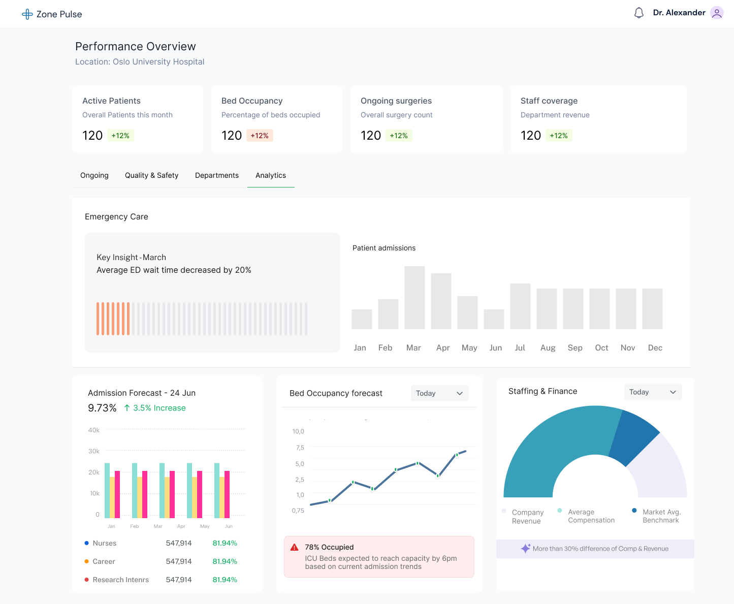
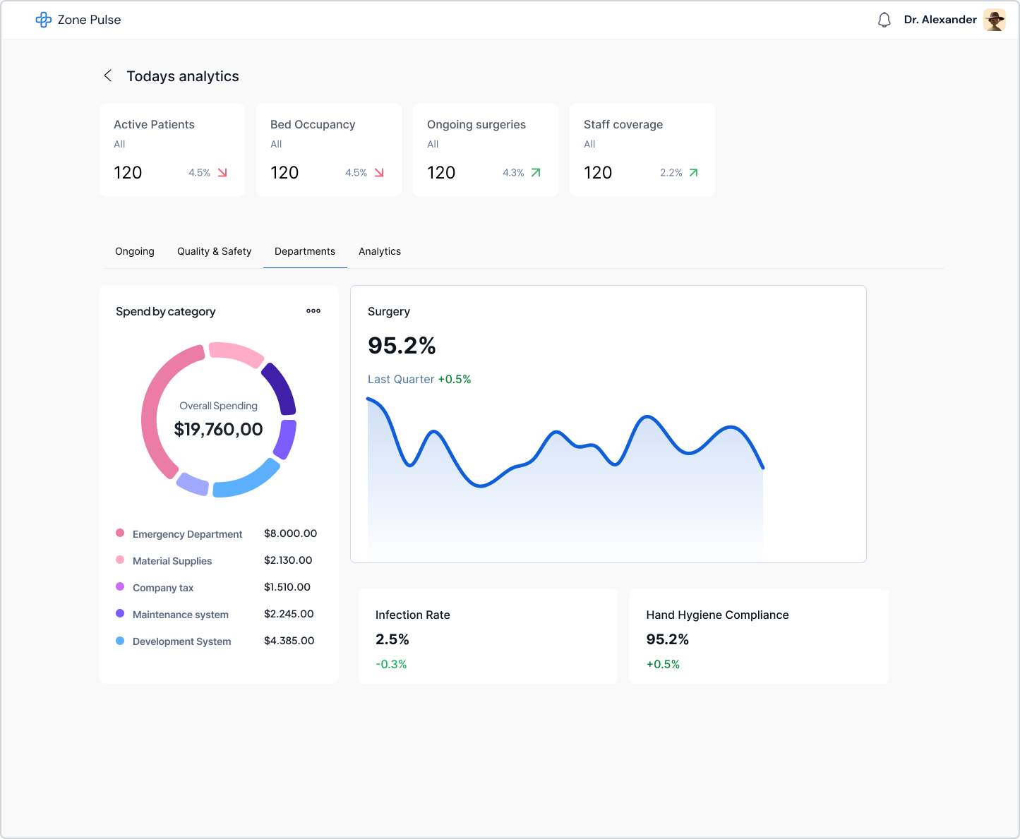
- Real-time bed and ICU usage with trend sparklines
- Project tomorrow’s capacity based on current trends
- Compare unit performance and staffing ratios side by side
- Critical Alert clarifications
Initial screens and wireframes for ZonePulse were rapidly iterated in Figma to validate design structure and user flows before finalizing visuals.
Provides an intuitive overview of bottlenecks.
Dashboard Overview (Wireframe) Top navigation bar with filters (date range, department), main grid of KPI cards, and AI insight banner below. Annotated hotspots for sparklines and alerts.
Alerts Panel (Wireframe) Sidebar listing alerts with colour blocks (Gray placeholder for each), export icon, and "Simulate" button.
Capacity Simulation Horizontal slider control with numeric input, dynamic bar chart showing projected bed occupancy, and "Apply" and "Reset" buttons at bottom.


In this project we addressed fragmented clinician analytics for the Nordics under GDPR-aligned controls. In simulated (AI-generated) validation, task success rate rose and time-to-insight rose 20%
"Whats next: Nordic specialty benchmarks, alert subscriptions, and connections to speed up decisions at the point of care."